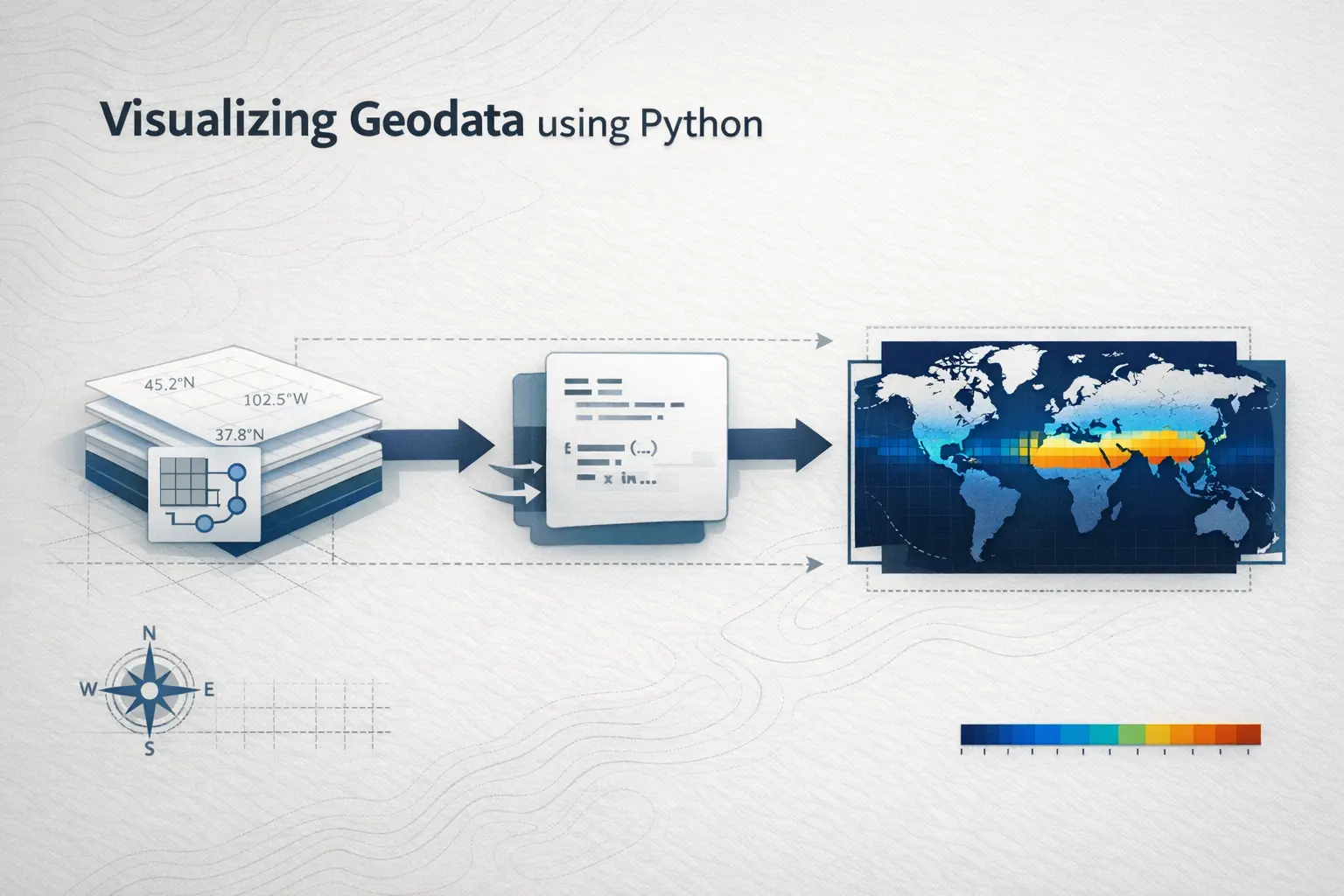
Turning Weather Into Art: Interactive Visualizations with Weather Next
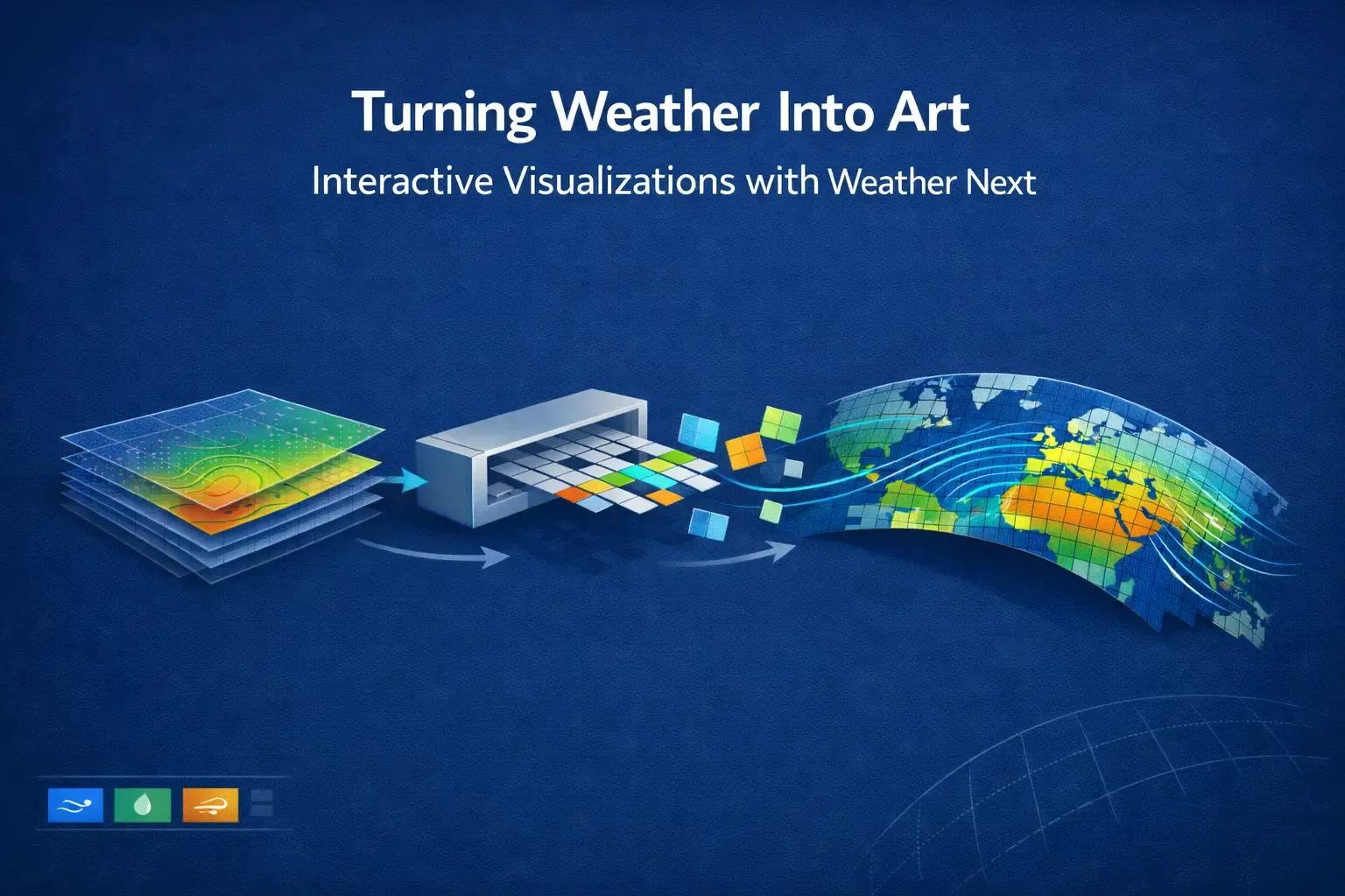
Overview
In today’s world, weather information is more important than ever, and it is a significant challenge to make it easy for people to see and understand weather patterns. Websites like windy.com have shown how powerful and useful interactive weather maps can be. They let users explore live weather conditions from anywhere in the world, right from their browser. In this project, we are building a basic version of such a weather map application.
We want to create a web-based visualization using weather data to showcase the following capabilities:
- Understanding of geospatial data and its processing capabilities.
- Understanding of the meteorology domain.
- Capability to showcase geo-based web applications
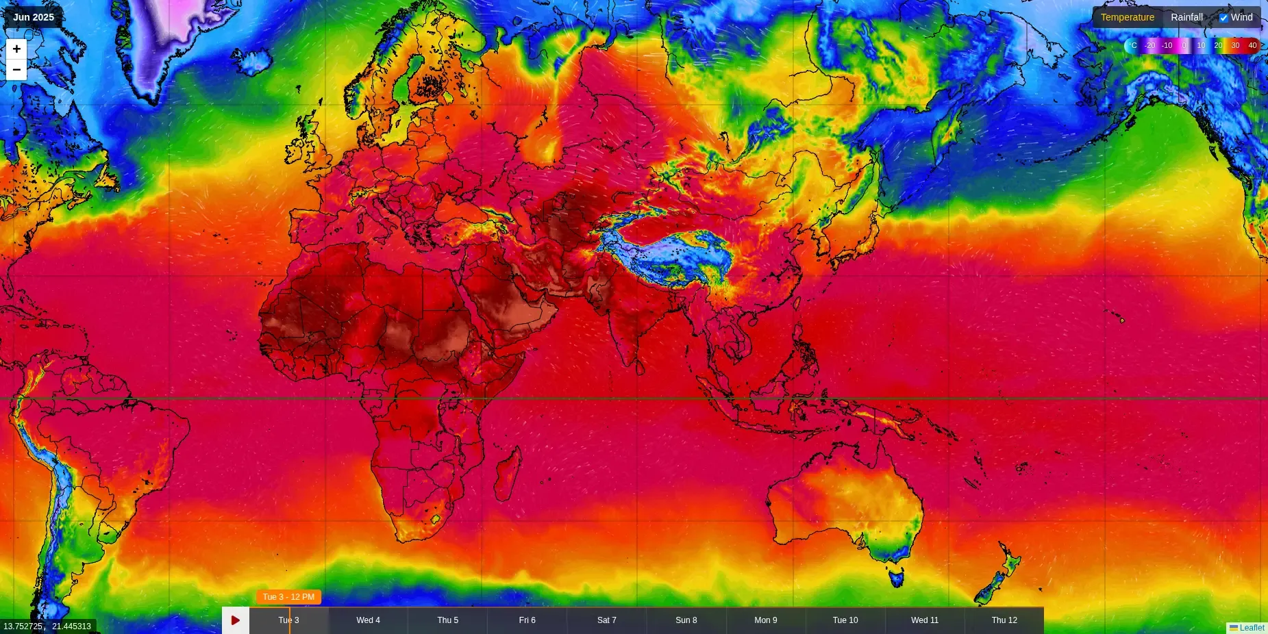
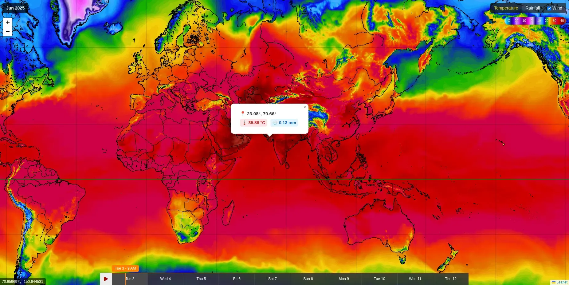
This is what our end result looks like:
Goal
- Create a web application to visualise weather parameters like temperature, rainfall, etc.
- Create a Realtime pipeline to capture and transform any open weather data to be usable in web applications.
Datasources
We have used Google DeepMind’s WeatherNext to display temperature, wind, and rainfall accumulation, selecting these from a wide range of available attributes. The Weathernext model provides predictions for five Earth surface variables (e.g., temperature, wind characteristics, and surface-level pressure) and six atmospheric variables like specific humidity, wind speed, and temperature, across 37 altitude levels, all at a high resolution of 0.25 degrees. Forecasts are available every 6 hours for a continuous period of 10 days(a total of 40 forecast points).
In our use case, we will focus on four data variables: 2m_temperature, Total_precipitation_6hr, 10m_u_component_of_wind, and 10m_v_component_of_wind.
The variables 2m_temperature and Total_precipitation_6hr both have scalar values. 2m_temperature specifies the temperature at 2 meters above surface level, while Total_precipitation_6hr provides the aggregated precipitation data for a continuous 6-hour window.
The 10m_u_component_of_wind and 10m_v_component_of_wind variables specify the u and v components of wind data at 10 meters above surface level. Since wind has both magnitude and direction, the resultant wind vector is computed as follows:
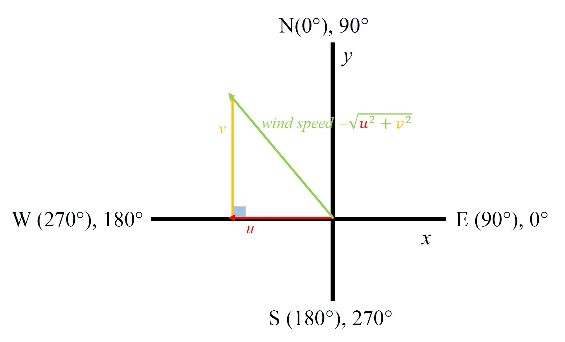
Fig-3: Wind Direction and Magnitude, Wind Speed Calculation
Techstack
-
Google Cloud Run is used to host the application.
-
leaflet.js is used on the frontend for interactive maps.
-
Weather data stored in zarr format is read and processed using xarray, and Apache Beam is used to transform this data into map tiles. Scipy for data interpolation.
-
To create a two-dimensional visualization of the world, Basemap (from Matplotlib) is used with the Mercator projection. Different shape files with coastline and country & states are used.
What is Leaflet?
Leaflet is a popular open-source library built with JavaScript for creating interactive web maps. In Leaflet, maps are made by loading many small square images called tiles. Each tile is a fixed-size image (usually 256x256 pixels) that covers a small part of the map.
In Leaflet, a Tile Layer is responsible for fetching tiles based on zoom level into a smooth, continuous map that users can interact with — zoom, pan, and move around.
When creating a weather map, we generate custom tiles that represent weather data, and we serve those tiles at different zoom levels.
Title layer in leaflet is represented like this:
L.tileLayer("https://your-tile-server.com/{z}/{x}/{y}.webp", {
  maxZoom: 10,
  minZoom: 2,
}).addTo(map);
Where,
{z}= zoom level (example: 2, 5, 8){x}and{y}= horizontal and vertical tile numbers at that zoom
At each zoom level:
- The number of tiles doubles in each direction compared to the previous level.
- So, the grid size is 2z × 2z tiles.
For a given zoom level:
| Zoom | Number of Tiles Horizontally and Vertically (x, y) | Total Number of Tiles (n) |
|---|---|---|
| 0 | 1,1 | 1 |
| 1 | 2,2 | 4 |
| 2 | 4,4 | 16 |
| 3 | 8,8 | 64 |
| n | 2n, 2n | 2n × 2n |
Tiles Generation
We run a daily automated Dataflow pipeline that processes new weather data as and when it becomes available. The pipeline reads zarr files from a Google Cloud Storage bucket and, for each data variable (such as temperature, wind, and rainfall), generates basemaps using the Mercator projection. These basemaps also include features like country borders, coastlines, and state lines, rendered at various zoom levels.
Tiling Strategy
We use a tile-based approach inspired by web mapping standards (e.g., Leaflet, OpenStreetMap). The entire world is divided into a grid of 2zoom × 2zoom tiles based on the zoom level.
So we have to divide our world map into different numbers of images as tiles.
- For longitude angles it’s straightforward:
- For a given number, min and max longitude can be calculated by:
-
tile_min_lon = -180 + (x * 360 / num_tiles)
-
tile_max_lon = -180 + ((x + 1) * 360 / num_tiles)
Where:
xis the horizontal tile index (column),num_tiles= 2zoom.
-
- For a given number, min and max longitude can be calculated by:
But in Mercator projection, getting min lat and max lat is challenging.
- Latitude Bounds:
- Because of Mercator’s distortion near the poles, computing latitude bounds requires a reverse mapping from tile Y coordinates to geographic latitude:
-
tile*max_lat = np.degrees(np.arctan(np.sinh(np.pi * (1 - 2 * y / num_tiles))))
-
tile*min_lat = np.degrees(np.arctan(np.sinh(np.pi * (1 - 2 * (y + 1) / num_tiles))))
Where:
yis the vertical tile index (row),num_tiles= 2zoom.
-
- Because of Mercator’s distortion near the poles, computing latitude bounds requires a reverse mapping from tile Y coordinates to geographic latitude:
For more information about the latitude bounds here.
Generating Weather Tiles
Once we have the min/max latitude and longitude bounds for a tile, we request that region to be rendered by Basemap. This allows us to overlay borders, coastlines, and other geospatial features. We then extract the corresponding subset of weather data (temperature, wind, rainfall) and apply custom colormaps to create visually meaningful tiles.
Handling Rainfall Data
One challenge with the WeatherNext dataset is that rainfall values are provided across all coordinates, even in regions where there is no actual rainfall. To handle this, we classify rainfall accumulation <=1mm as “no rain”, effectively masking those areas. Additionally, to improve visual interpretation, especially for heavy rainfall regions, we apply a log-normal (lognorm) scale to the rainfall data for better contrast and detail.
Interpolation
As we generate map tiles at higher zoom levels, each tile represents a smaller geographic area. This naturally causes our subset of data to narrow down, which can lead to discontinuities between neighboring tiles - especially in regions where the original data is sparse or unevenly distributed.
To address this, we implemented quintic interpolation to smoothly fill in the gaps. This method allows us to estimate values in areas between known data points with a high degree of smoothness, preserving gradients and patterns. Additionally, we pre-fill extra values to maintain a complete 2zoom × 2zoom tile grid at each zoom level. This approach ensures that tiles align seamlessly, creating a continuous and visually coherent map, even at the most detailed zoom levels.
Another challenge we faced was at the edges of the global longitude range. Our dataset originally provided values only from [-180°, 179.75°] longitude, which left out the extreme boundary at 180°. This missing data created visible artifacts, often appearing as thin white strips, especially near the International Date Line.
To resolve this, we replicated the edge values: using the data from -180° for 180° as both are the same. This small but crucial adjustment ensured a seamless wraparound of the map, preventing visual gaps and improving the continuity of our tile rendering across the entire globe.
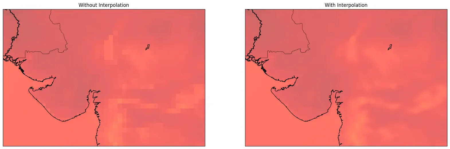
Fig-4: Comparison of Temperature Tiles With and Without Interpolation
Weather Information
We want to display weather information for specific latitude-longitude coordinates. There are two possible approaches:
- Pre-generate static JSON files for each timestamp and send them to the frontend to display as popups.
- Set up an API route that listens for specific lat-lng requests and returns the corresponding weather data.
The second approach involves deploying an additional Cloud Run function or API endpoint that reads JSON files and extracts data based on the requested coordinates. However, this method can be inefficient due to the potentially large file sizes and the overhead of multiple network requests. To improve performance, the JSON files can be partitioned strategically, and caching mechanisms can be implemented to store frequently accessed data and reduce redundant reads.
The first approach is generating weather data for all lat-lng points, which results in very large JSON files (8–10 MB), which is not feasible to send to the frontend.
Optimized Solution:
We store weather data for each tile in zipped JSON format in the same path as the tile. We reverse calculate the X, Y coordinates of the tile based on lat/lon and zoom, and recreate the path in GCS to fetch the JSON data. For better optimization, we store the data for a particular timestamp/lat/lon in the current state to avoid fetching the same data multiple times.
Web Rendering
Static Tile Hosting via GCS
All tiles are generated and stored as .webp images in a GCS bucket. To optimize for performance and scalability, we serve these tiles statically directly from GCS without requiring any backend API or proxy service.
To enable public access to the tiles, we configure the GCS bucket to allow public read access. This turns GCS into a static tile server with minimal overhead.
gcloud storage buckets add-iam-policy-binding gs://{bucket_name} --member=allUsers --role=roles/storage.objectViewerOnce configured, any tile can be accessed through a public URL, and Leaflet will automatically fetch and render the appropriate tile images based on the current view.
Frontend
On the frontend, we use Leaflet.js to render interactive weather data layers, including temperature and rainfall accumulation. These layers are visualized as map tiles and loaded using Leaflet’s built-in TileLayer component. The tiles are requested dynamically based on the current map view and user interaction.
Tile URL Format
A standard URL structure is used to serve each tile:
{gcs_bucket_public_url}/{storage_location}/{time}/{z}/{x}/{y}.webpzis the zoom levelxandyare the tile coordinatestime: Forecast timestamp, which allows users to browse through weather tiles for different forecast intervals.
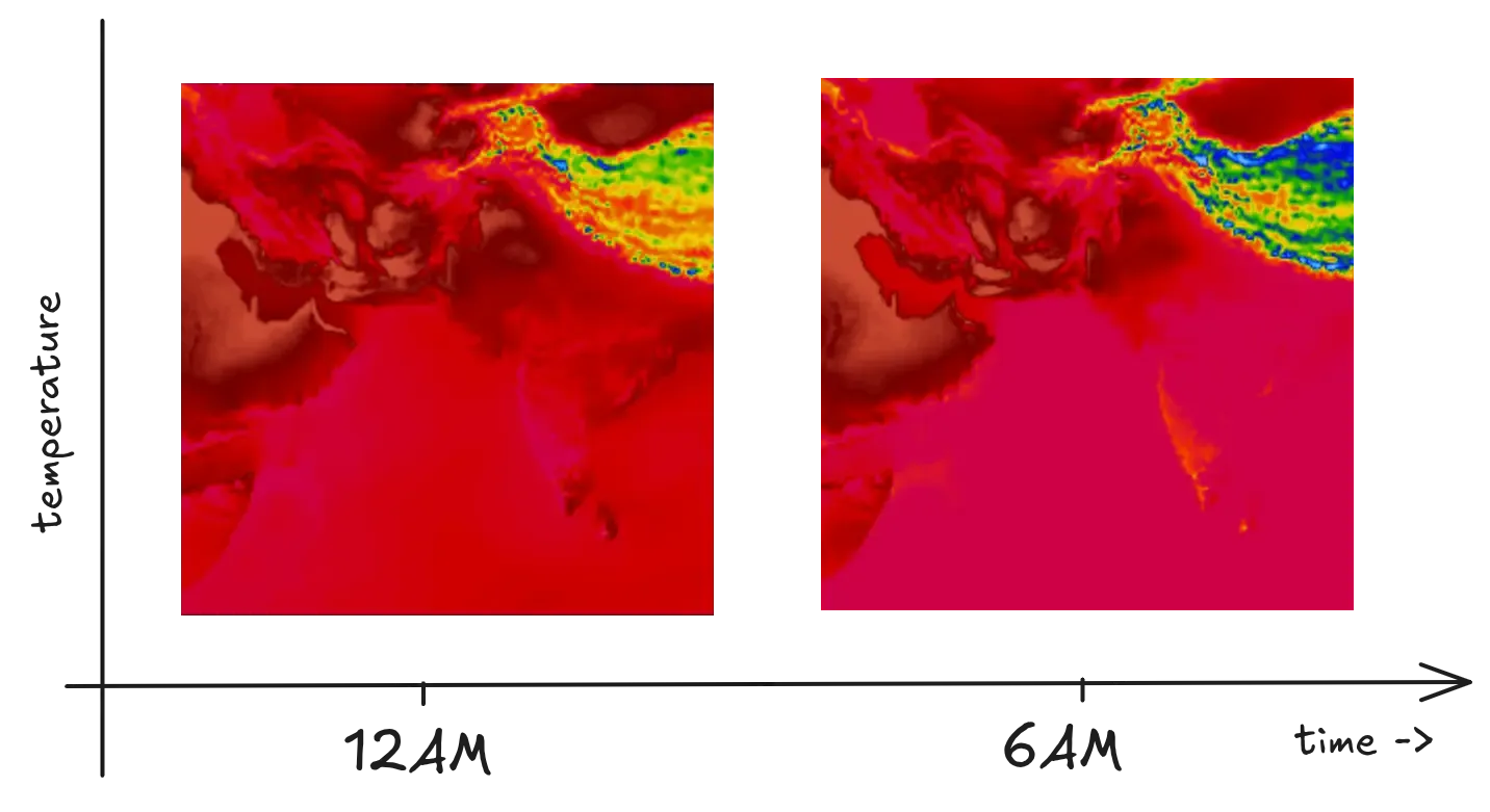
We’ve integrated a timeline player that animates weather data across different forecast times. The player updates the map in 1-hour intervals, enabling users to visualize how weather conditions evolve over time.
In the WeatherNext dataset, forecasts are available every 6 hours for a continuous period of 10 days. At each 6-hour interval on the timeline player, a new TileLayer is instantiated and added to the map to reflect the latest forecast tiles. The previous TileLayer is removed to prevent outdated tiles from being rendered and to optimize performance.
map.removeLayer(currentTileLayer);
currentTileLayer = L.tileLayer(newUrl).addTo(map);
This ensures the data is always current, without needing to refresh the entire page.
Wind data overlay is drawn on top of the canvas, offering a clear view of wind flow patterns without interfering with the underlying temperature visuals.
To provide better spatial reference, we display country names at their respective coordinates using Leaflet’s L.marker:
To further enhance geographic clarity:
-
Graticules (latitude/longitude lines) are rendered using the leaflet-graticule package. These lines assist with orientation and scale at various zoom levels.
-
The equator is drawn separately using a Polyline, and we’ve styled it with a thicker line weight to make it easily distinguishable from other graticules.
Wind Layer Animation
For the wind visualization layer, we integrated an animated flow map using a particle-based canvas overlay. This implementation is inspired by Windy.js, a library designed to animate wind field data over geographic maps.
Projection: Mercator
Since Earth is spherical, and we draw on a 2D canvas, we need to project lat/lon into x/y coordinates for wind vectors. This is done with the Mercator projection.
Grid Interpolation
The wind data is in a coarse grid. But we need to move particles smoothly across the field, not just in blocky steps. It estimates the wind at any location by performing bilinear interpolation using the four nearest grid points.
Particle System
Thousands of tiny particles are randomly scattered across the map. Each particle represents a bit of airflow that moves according to the underlying wind data at its current position.
Particle Movement
-
Position Sampling: For each particle at its current x,y position, it samples the wind vector field to get the wind direction and speed at that exact point.
-
Vector Interpolation: Since wind data typically comes as a grid of points, the code uses bilinear interpolation between the four nearest grid points to calculate a precise wind vector at the particle’s location.
-
Position Update: The particle’s position is updated by adding the interpolated wind vector:
particle.x += windVector.u;particle.y += windVector.v;
Movement & Fading
As particles move, they create streaks that visually represent wind flow. The canvas slightly fades each frame, creating trails that show wind direction and intensity. Particles that exit the map or complete their lifecycle respawn at new random locations, maintaining continuous animation.
Canvas Rendering
Everything renders directly on HTML5 Canvas for optimal performance. This efficient approach enables smooth animation of thousands of particles simultaneously, with color variations indicating wind speed differences.
Transforming data
Wind data consists of the u component and the v component, where weathernext has 1,038,961 points in each component with a difference of 0.25 lat/lng. Serving this large data will result in much delay, so we reduced the data by taking weather values at an interval of 1 lat/lng and compressed the file into a zip, and were able to reduce almost 70% of the size. dd
Fig-6: Particle-Based Wind Layer Overlaying Temperature/Rain layer
Mapping
We have used custom shape files with different administrative levels. With the increasing zoom level, we added more details.
| Zoom Level | Geographical Features | Labels |
|---|---|---|
| Min Zoom: 0 (Global) | Coastlines (Basemap) | Graticules lines |
| 1 | Coastlines (Basemap) | Graticules lines |
| 2 | Coastlines, Country borders (Natural earth sw: 0.5) | Graticules lines |
| Default Zoom: 3 | Coastlines, Country borders (Natural earth sw: 0.5) | Graticules lines |
| 4 | Coastlines, Country borders (Natural earth sw: 0.5) | Graticules lines, Country names appear |
| Max Zoom: 5 | Coastlines, Country borders (Natural earth sw: 0.5) | Graticules lines, Country names |
| 6 | Costlines, Country borders (Natural earth sw: 1), State border | Graticules lines, Country names |
Where:
sw = stroke width
Conclusion
In this blog, we’ve explored the step-by-step process of creating a dynamic weather application. We have shown how to take complex forecast data and turn it into an interactive world map that visualizes temperature, rainfall, and animated wind patterns.